As we know Microsoft is gearing up the Release Preview of Windows 8 early next month and at the same time – it may be accompanied by Visual Studio 11 RC.
In a recent blog post authored by Microsoft’s Monty Hammontree – Director of User Experience, Microsoft Developer Tools Division has shared an update on changes in Visual Studio 11 since Beta. On basis of feedback, Microsoft has made various modifications to Visual Studio User Interface.

All the changes made in Visual Studio 11 RC have been centered on three main aspects:
- An overall desire for more visual “energy” and contrast
- Calls for a more balanced application of Metro styling
- A desire for greater icon clarity and differentiation through the use of color
With the release of Visual Studio 11 Beta back in February of this year, we introduced changes to the user experience based on two core design principles, the first being to give you more space for your content and the second being to draw more focus to that content,” explained Hammontree.
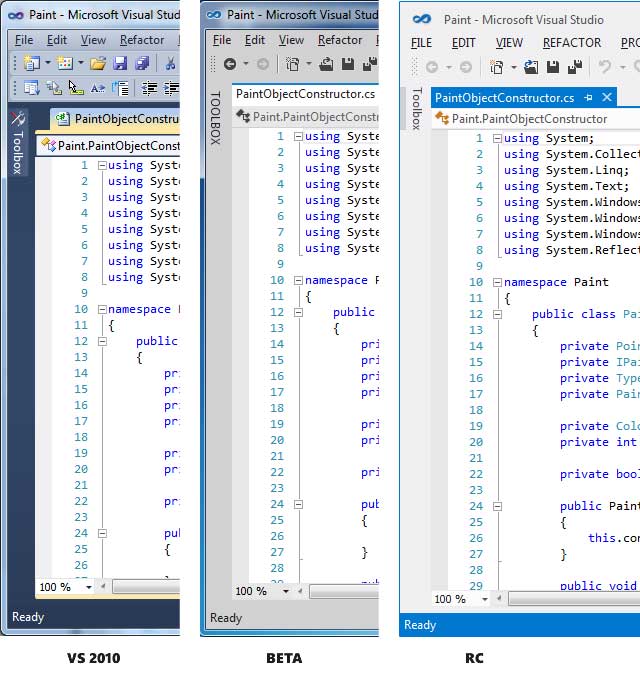
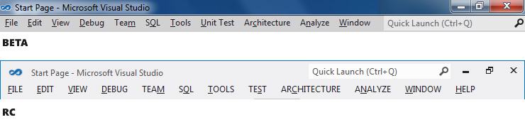
Here is a quick glimpse at the changes we’ve made from beta to RC.

Leave a Reply